A post went round this week announcing that Anthropic had killed AI slop in web design. It had the shape those posts always have: a huge star count, a huge install count, a list of aesthetic directions you can summon by name, and the promise of production-ready HTML, CSS, JS, React or Vue. It is called Frontend Design. One install, available in every session.
The install command is real and it works. I ran it. Then I did the thing this site does with every dependency, which is read what actually landed on disk:
npx skills add https://github.com/anthropics/skills \
  --skill frontend-design

.claude/skills/frontend-design/
├── SKILL.md      8,260 bytes
└── LICENSE.txt   Apache 2.0
That is the entire product. One markdown file: 55 lines, 1,336 words of English, and a licence sitting next to it. No code. No stylesheet, no component, no colour tokens, no generator, nothing that runs. The thing with three quarters of a million installs is a memo.
Which is not a criticism. It is the most interesting fact about it, and the rest of this post is about why a memo is worth reading twice.
763,000
installs
the viral claim, and it is real
1,336
words on disk
what actually landed
3
looks it names
cream, near-black, broadsheet
1
paragraph that matters
the measurement, not the advice
The numbers check out. The description does not.
This site has a rule about invented numbers, so I checked the ones in the announcement rather than repeating them. 167,624 stars on anthropics/skills at the time of writing: true, and it is a repository of eighteen skills, so none of those stars are a verdict on this one. skills.sh counts 763.3K installs for frontend-design specifically, out of 2.8M across the repo, so it is the most-installed of the eighteen by a factor of two. The claimed 758,000 was simply a few days stale. Every number in that post survived checking.
The description did not. Three claims, three greps.
“You can ask it for brutalist, editorial, retro-futurist, luxurious, maximalist, organic.” Search the file for those six words and you get exactly one hit: maximalist, in a sentence about matching execution effort to ambition. There is no menu, no mode, no direction you select. Nothing in the file takes an argument, because the file is prose.
“Production-ready HTML, CSS, JS, React or Vue.” The word CSS appears once, in a warning that generated selectors tend to cancel each other out when a class-based rule and an element-based rule both set padding on the same section. React and Vue appear zero times. The skill has no opinion about your framework because it never touches one.
“It forces the model to commit before writing a line of code.” This one is close to true, and it is the only mechanical thing in the file. It asks for two passes: a written plan first, then a critique of that plan, and only then the build. Nothing enforces it. It is an instruction, and instructions are followed the way instructions are followed.
What is actually in the file
It opens by casting a role, and the casting is specific enough to do work: the design lead at a small studio, with a client who has already rejected proposals that felt templated and is paying for a point of view. That single clause does more than any adjective would. It sets a prior. Templated output has already failed here, so producing it again is not neutral, it is a repeat of a known mistake.
Then the plan it wants, before any code: a palette as four to six named hex values, typefaces for two or more roles, a layout concept sketched as prose and ASCII wireframes, and a signature: the single element the page will be remembered by. Four fields. The interesting one is the last, because it forces a ranking. If everything on the page is memorable, nothing is, and asking for one signature makes every other decision subordinate on purpose.
The line I did not expect is near the end of the process section: do a lot of this planning in your thinking, and only show ideas to the user when you have higher confidence. A design skill that tells the model to stop narrating. Half of what makes AI output feel like AI output is being made to watch it think out loud, and somebody noticed.
The paragraph the whole file is for
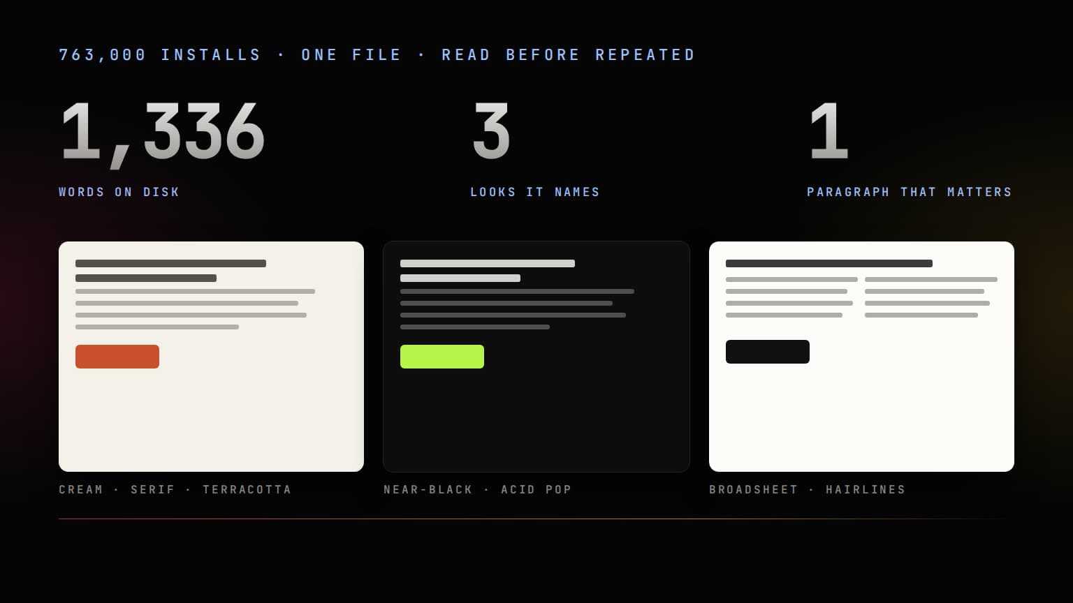
One paragraph in the middle is worth the other fifty lines, and it is the one nobody quoted. It says that AI-generated design right now clusters around three looks: a warm cream background near #F4F1EA with a high-contrast serif and a terracotta accent; a near-black background with a single bright acid-green or vermilion accent; and a broadsheet layout with hairline rules, zero border radius and dense newspaper columns. All three are legitimate for some brief. All three appear regardless of the brief.
It is easier to see than to read, so here they are, drawn from that description and nothing else. One hex value is quoted; the other two are mine, picked to match the words. Same skeleton in each, because the skeleton is the tell:
One skeleton, three skins: eyebrow, headline, rule, body, button, in the same order, at the same size, in all three. Read as a description of the coffee, none of them tells you anything the other two do not. None of them is bad, either. That is the problem the paragraph is pointing at.
Notice what the announcement got backwards. It said the problem is Inter and purple gradients. Neither word is in the file. The one gradient it does name belongs to a different template: a big number with a small label, supporting stats and a gradient accent, which it calls the template answer for a hero and tells you to use only if it is genuinely the best option. Purple gradients were the 2024 tell. These three are the 2026 ones, and two of them are what you get when a model has already been asked not to look generic. The defaults moved because the correction moved.
Here is why that paragraph is the actual product. I could have written the rest of the file myself, and so could you: spend your boldness in one place, structure should encode meaning, match complexity to the vision. Every art director has that speech. The part neither of us can write is the description of what the median output currently looks like, because that is not a design opinion, it is a measurement of a distribution, and it comes from the people who can see the whole distribution. The file is not advice. It is a fingerprint of the thing you are trying to steer, and fingerprints go stale, which is why this one was last revised in June.
My site is number two
Near-black background. One accent, used sparingly. #000000 and #9ec1ff, and that second value appears on precisely one page. I read that paragraph and recognised my own homepage in it, which is a bad afternoon.
The defence I would offer is thin but real: the wordmark ramp is five stops rather than the usual two, because a straight pink to orange gradient drifts through a muddy salmon in the middle, and knowing that is a choice rather than a default. The rest of the defence is rationalisation. Black plus one accent is where I landed without ever writing down an alternative, and that is exactly the condition the paragraph describes: not a bad choice, an unmade one.
So did I redesign the site? No, and the reason matters. The last time I moved one page to a different palette and a different display face it came out worse and went back within the day. Escaping a category is not a design brief. The useful reading of that paragraph is not your site is slop, it is the axes you never chose got filled in for you. Some of mine were chosen. The ground colour was not. I know that now, and the next page I build starts from that knowledge rather than from habit.
The two rules I am keeping
Spend your boldness in one place. Let the signature be the one memorable thing and keep everything around it quiet. The file lands this with a Coco Chanel line, which I resented and then wrote down: before leaving the house, look in the mirror and remove one accessory. It also refuses to let that become an excuse, immediately: not taking a risk is itself a risk.
Structure is information. Numbering, eyebrows, dividers and labels should encode something true rather than decorate. The example it picks is the 01 / 02 / 03 marker, which is only honest when the content really is a sequence. That sent me to my own components. The numbered list on this blog earned it: it renders installation steps, in order, where step two after step one is the information. The little number before every heading on this page was the one I had to think about, because a CSS counter puts it there and nothing ever asked whether the sections were a sequence. They are, narrowly. This post is an argument built in order and the number tells you how far through it you are. If these were unrelated tips I would delete them. The eyebrow above the title is a category and a date, both true. The audit took four minutes and I recommend it more than I recommend the skill.
What installing it actually does to your repo
Worth knowing before you run the command, because the install is not nothing.
By default it copies rather than symlinks, so the file lands in your repository as a normal file and the Apache licence lands beside it. It also writes a skills-lock.json pinned to a content hash, which means the copy is frozen: the upstream file was revised in June and will be revised again, and yours will not move until you run npx skills update. That is the right default and it is worth knowing you now own a stale copy by design. Adding -g puts a second copy in ~/.claude/skills for every project on the machine. I have both, deliberately: the global copy so it is always there, the repository copy so it travels with this site.
The installer prints one line at the end that deserves more attention than the star count: review skills before use, they run with full agent permissions. This one is inert prose and I verified the copy is byte-identical to upstream. The next one you install might not be prose at all. Reading the file first is 1,336 words of work, and it is the whole security model.
Receipts, since this post is mostly numbers:
# stars, straight from the API
curl -s https://api.github.com/repos/anthropics/skills

# what actually landed
wc -l -w -c .claude/skills/frontend-design/SKILL.md
#   55    1336    8260

# same file as upstream, or not
shasum -a 256 .claude/skills/frontend-design/SKILL.md
curl -sL https://raw.githubusercontent.com/anthropics/skills/\
main/skills/frontend-design/SKILL.md | shasum -a 256
# 1608ea77…  both
So does it work
One honest test, because one is what I ran. The cover of this article was made under the skill's own process: a written plan first, with a named palette and a signature, then a critique of that plan, and only then the build.
What the process changed: the first plan was a glowing sheet of paper on black, meaning the whole framework is one file. The critique pass killed it, because that is a joke about the packaging rather than an image of the subject, and the subject is what the file says about design. The plan that replaced it names its signature outright: three posters with identical bones and different skins, which is this article's argument stated once, before the first paragraph.
What it did not change: the palette. Black, with the pink and orange rim this site already owns, because the brief pinned it and the skill is explicit that the brief's own words always win. I built that plan twice, once as a flat page rendered in a headless browser and once as a photograph out of gpt-image-2, and shipped the photograph for a reason the plan had already settled: every other cover on this blog is a photograph, and a flat illustration would have introduced a second visual language to the blog on an article about not acquiring looks by accident.
That is the honest verdict. It does not make a model a designer. It moves the failure mode: instead of a competent template you get a committed direction, and a committed direction can be wrong. Wrong is much easier to fix than generic, because you can say what is wrong with it. Nobody has ever successfully described what is wrong with fine.
The verdict on a memo
Frontend Design is a prompt. 1,336 words, no code, and an install step whose entire function is to copy a file into a folder your agent already reads. If that sounds like a let-down, consider what the alternative would have to be: a framework that generates design is a design system, and a design system that ships with the model is the definition of the problem it claims to solve.
A memo collected three quarters of a million installs because “make it not look like that” is the hardest instruction to write yourself, and this file writes it, with the specific hex value of the thing you are trying to avoid. Read it. Then decide which of your defaults you actually chose. That part takes an afternoon and no install at all.