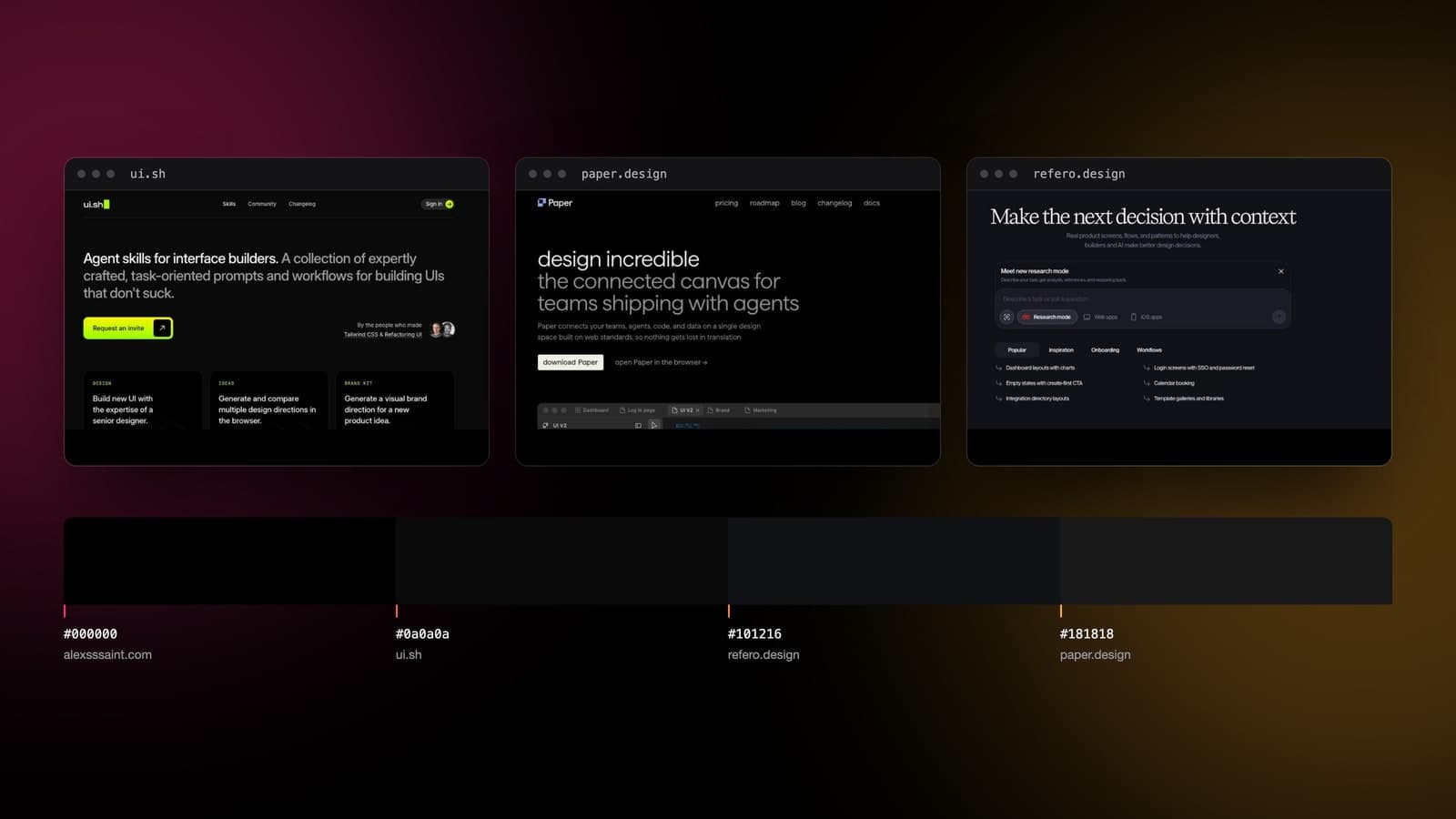
Last week I read Anthropic's frontend-design skill and concluded that the valuable part of it was a single paragraph: the one describing what AI-generated design currently looks like, because that is a measurement of a distribution and not a design opinion. Then @medhansh pointed me at three tools that claim to fix the thing the paragraph describes, and I have been using some version of that stack since. Paper for the canvas, Refero so the output does not read as generic, ui.sh for polish.
Nobody is paying me for any of this. So I did what I did last week, which is try to install all three and write down what actually happened.
Two of the three doors were locked, one of them turns out to be the only genuinely new thing in the stack, and all three of their websites are painted the colour the skill warns you about. In that order.
They are not three competitors. They are three layers.
taste in · code out
01
refero.design
the corpus: real sites to steal from
02
paper.design
the canvas: compose the direction
03
ui.sh
the skills: turn it into components
This took me longer to see than it should have, because they are presented as a list. They are not a list, they are a pipeline, and each one owns a different part of the job that the free memo asks for and cannot do.
Refero is the corpus. 135,000-odd screenshots of real shipped product UI from 400+ web and iOS products, searchable by tag, by company, by font, with the user flows kept in order from signup through cancellation. Its MCP hands that library to the agent so it can look at what six real companies did with a pricing page before it writes one.
Paper is the surface. A design canvas whose native format is HTML and CSS rather than a proprietary document, so an agent reading the canvas gets real computed styles and an agent writing to it writes the thing that ships. Its MCP exposes 21 tools, and the split tells you the whole story: get_computed_styles, get_jsx, get_screenshot on the read side, write_html, update_styles, create_artboard on the write side. It is a canvas an agent can hold a pencil in.
ui.sh is the judgement. Nine skills from Adam Wathan and Steve Schoger, who made Tailwind CSS and wrote Refactoring UI: Design, Ideas, Brand Kit, Componentize, Canonicalize Tailwind, Add Dark Mode, Dark Mode Image, Make Responsive, Markup From Image. This is the layer that overlaps Anthropic's free file, and the overlap is only on the first two.
Read that way the stack makes sense in a way the tweet did not. Reference, surface, taste. The memo I spent last week on covers the third layer and has nothing at all to say about the first, which is the gap worth paying attention to. More on that below.
3
tools in the stack
ui.sh, refero, paper
2
behind paywalls
the doors locked mid-tour
1
colour they share
a near-black ground
4
near-blacks measured
off the live sites
What happened when I tried to install them
Three commands. One of them I could not even reach.
# Refero. The command is right, the token is the product.
claude mcp add --transport http refero \
  https://api.refero.design/mcp \
  --header "Authorization: Bearer <token>"

curl -s -X POST https://api.refero.design/mcp -d '{"method":"tools/list"}'
# 401  {"error":"Unauthorized"}

# Paper. Not a remote server at all: a local one.
claude mcp add paper --transport http \
  http://127.0.0.1:29979/mcp --scope user

curl -s http://127.0.0.1:29979/mcp
# 000  connection refused
Neither of those is a failure, they are both the design. Refero's MCP is gated behind Refero Pro, so the 401 is the paywall answering correctly. Paper's MCP is not a cloud endpoint you authenticate to, it is a port on your own machine that only exists while Paper Desktop is running, which is a genuinely good decision that nobody mentions: your design file never leaves the laptop for an agent to read it.
ui.sh has no command at all. It is invite-only, it is not on skills.sh (I searched: the index returns shadcn and nothing from ui.sh), and the install is an npx line carrying an account token you get after you are let in and have paid. The button on the homepage says Request an invite. So the one layer of the stack that is pure design judgement, from the two people with the strongest claim to sell it, is the one layer I cannot show you a single line of.
Then I looked at the three websites
This was not a gotcha I went looking for. I opened all three to read them, and by the second one I was already sampling background colours out of the console, because something felt familiar and it was not the copy.
Here is last week's paragraph again, the one I said was the whole product: AI-generated design clusters around three looks. A warm cream ground near #F4F1EA with a high-contrast serif. A near-black ground with a single bright acid-green accent. A broadsheet of hairline rules and dense columns.
ui.sh: ground #0a0a0a, one accent, #bdff23, an acid green used on the button, the eyebrows and nothing else. Refero: ground #101216, headline set in a high-contrast serif, Design Research for the AI Era. Paper: ground #181818, body text in a warm cream that resolves to #efefe4, which is five points of red away from the exact hex Anthropic prints as the tell.
And when I drew that acid-green default myself last week, from the skill's words and before I had ever seen ui.sh, the swatch I picked was #C6F24E. Theirs is #bdff23. I was nine points off on a colour I invented from a sentence.
The four grounds, side by side, no dividers, mine included:
#000000
alexsssaint.com
this site
#0a0a0a
ui.sh
the skills
#101216
refero.design
the corpus
#181818
paper.design
the canvas
Four grounds, touching, no dividers. Three of these sites sell you a way out of AI design defaults. The fourth is mine, and I already admitted last week that its ground colour was never chosen. The widest gap in the row is 24 points of red out of 255.
Why that is not the joke it looks like
The cheap version of this post ends there, and the cheap version is wrong. Three points against it, and I think they matter more than the catch.
First, near-black is the convention of the category these products sell into, not evidence of a model choosing it. Developer tools have been dark since long before any of this. A design tool for people who live in an editor that is already dark is making an audience decision, and an audience decision is a decision.
Second, and this is the part that actually changed my mind about last week's post: the skill's three looks were never described as AI's inventions. They are the looks AI output clusters around, and models cluster around them because that is where the training data already is. Which means the paragraph is not a fingerprint of AI design. It is a fingerprint of design, in 2026, and AI is just the instrument sensitive enough to have printed it. Human studios landed on near-black plus one accent first. The model followed them there.
Third, I am in the row. This site is #000000 and I said last week that its ground colour was an axis I never chose. Standing in the swatch pointing at other people's swatches is not a position.
So the honest finding is narrower and more useful than the catch. Every one of these products is fluent about the layer it sells and quiet about the layer it stands on. Refero will show you 135,000 screens and its own ground is the default. That is not hypocrisy, it is the exact thing the skill describes: the axis nobody argued about got filled in by the room.
The layer that is genuinely new
Strip the three tools down and two of them are better versions of things that exist. Paper is a design canvas, and design canvases exist; what is new is the format underneath, which is a real architectural choice and not a feature. ui.sh is written taste, and written taste is what the free file already is; nine skills against one is a difference of surface area, from people whose surface area I would bet on.
Refero is the one with no free equivalent, and the reason is exactly what I wrote last week without noticing I was writing it. The memo can tell a model what the median currently looks like. It cannot show it anything. It contains zero examples, because a markdown file cannot carry 135,000 screenshots, and the correction to you are producing the median is not a stronger adjective, it is a specific alternative in front of you. A corpus is the one part of this problem you cannot solve by writing a better prompt.
Whether Refero's corpus is the right one is a separate question I cannot answer from outside the paywall, and there is an obvious failure mode: a library of 400 best-in-class products is a library of what already won, and grounding every decision in what already won is a recipe for a very well-researched median. The pitch and the risk are the same sentence. That is worth knowing before you subscribe, not after.
The receipts on Paper, since somebody ran them
I could not run Paper without installing the desktop app, but Braintrust benchmarked it against the Figma MCP, 27 pages, three trials each, and the result is more interesting than a win would have been. Visual similarity came out 0.716 for Paper against 0.679 for Figma, at p = 0.21, which is a tie and should be reported as one.
The gap that was not a tie is cost. Figma took about 42% longer per run, 568 seconds against 400, and cost 32% more per point of visual quality, $3.73 against $2.82, with roughly 1.9 times the run-to-run variance. So the honest claim for Paper is not that it designs better. It is that it gets to the same place cheaper and more predictably, which is what you would expect from removing a translation layer, and it is a much more credible claim than the one on the homepage.
Watch someone actually use the one I cannot
Since I cannot show you ui.sh myself, here is twelve minutes of someone who is inside it running the skills against a real project. Worth it for the moment the /ideas skill spins up a local server and opens three directions in a browser instead of describing them, which is the single most sensible idea in the whole stack.
What it costs
Nobody in the thread mentioned a price, so here is the bill, with the one figure I could not verify marked.
frontend-design   $0            1 file, 1,336 words, Apache 2.0
Paper             $0            free tier, 100 MCP calls/week
                  $192/yr       Pro, billed yearly ($20 monthly)
Refero            €0            free tier, ~3% of the library
                  €120/yr       Pro. MCP and Skill are Pro-only
ui.sh             $120/yr       personal   ← unverified, invite-walled
                  $300/yr       commercial above $250k revenue

paid floor        €120 + $120/yr, Paper on free
full stack        €120 + $120 + $192/yr, before tax
Paper's free tier is the surprise in that table. 100 MCP tool calls a week is not a teaser, it is enough to actually work, and given that the MCP runs on localhost against a file on your own disk, the free tier is the whole product for one person. Refero is the opposite: the free tier is roughly 3% of the library and the MCP is not in it at all, which is coherent, because with Refero the library is the product.
The verdict I can actually stand behind
I have not run two of these three, and I am not going to pretend otherwise to give this post a tidier ending. What I can say is what changed in how I think about it.
The stack is real and the shape of it is right. Reference, surface, judgement is a better decomposition of “make it not look generated” than anything I would have written down, and I am grateful to have been handed it. The layer I underrated is the corpus, and I underrated it in public last week by calling a description of the distribution the whole product. A description tells a model what to avoid. Only examples tell it where to go instead.
The layer I would still start with is free. Read the 1,336 words, do the four-minute audit of which of your defaults you actually chose, then decide whether the thing you are missing is taste or references, because those are different purchases and only one of them is €120.
And whichever you buy: sample your own background colour first. All four of us are the same black, and three of us are selling the way out of it.